Back when my old company was still using Windows 2000, we needed a way to let people know if email was down or if the Blackberry service was due for maintenance. Sending an email every time was deemed too spam-like so management ask me to design an icon to be displayed in the Windows taskbar on every employee’s computer so they could see at a glance if there were any problems.
The icon would communicate the following states:
- Everything is OK
- There are problems with one or more minor systems
- There are problems with one or more major systems
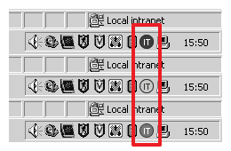
Clicking on the icon would lead to an existing page on the intranet which showed the status of each IT system:
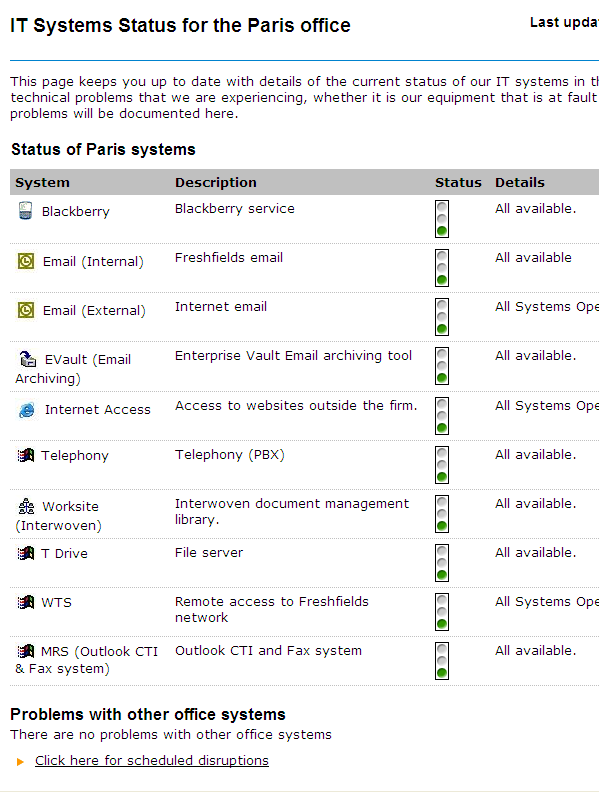
IT systems status page
Analysis
Step 1 – Eliminate any unnecessary design constraints
The head of the IT department strongly suggested using a traffic light symbol as it was already used on the status indicator page. I argued that although visual consistency was usually a good thing, in this case it would force us to use at best only a third of the 16 pixel icon to show the state and it would be quite hard to notice at a glance.
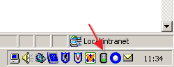
Existing traffic light symbol
Step 2 – Uncover any constraints that the client hasn’t thought of yet
If everything is working fine right now, you don’t need to be told about it, so the ‘everything ok’ state should be quite neutral and unobtrusive. There is also a slight issue with the red/amber/green metaphor – true amber wasn’t available in the 16 bit colour palette used for Windows 2000 icons. I tried dithering yellow and orange together to get close to amber but it only made the icon look muddy. However I predicted that yellow would be understood just the same in context. Finally we needed a 4th state to indicate when no information was available.
Step 3 – Understand how the client likes to work
Sometimes there is a difference between what the client wants and what they need, so you have to choose a suitable negotiation strategy to close that gap. Some clients are satisfied with an explanation of the design theory behind the issues, but sometimes they prefer hard evidence, as was the case with amber vs yellow – so I let the user testing results convince them later on.
Initial ideas
I experimented on paper first with indicators based on various metaphors including ‘Container’ and ‘Progress bar’. I also worked with the traffic light idea a bit more in case I could find a compromise for what the client wanted initially. To keep things simple, I applied the colour coding from traffic lights to all the ideas:
- red for strong warning (problems with one or more major systems)
- yellow for mild alert (problems with one or more minor systems)
- green for all systems go
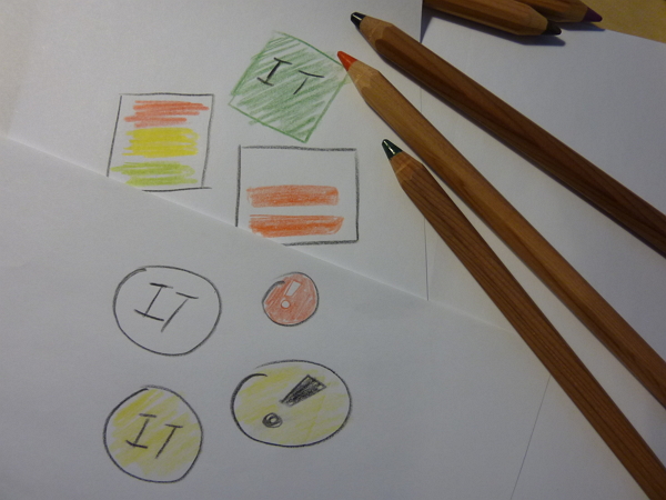
Sketching icon ideas
Prototypes
I drew the icons in their target resolution to see how they would fit in the taskbar, but most felt unsatisfactory – it’s not clear what information they were trying to convey. Quick 5-second recognition tests around the office confirmed this.
Icon prototypes
Finally I settled on the traffic lights metaphor but crucially I showed only the actual relevant light maximised in the 16×16 pixel icon space. It was an extra abstraction but one that kept some visual consistency with the traffic lights on the status page.
User testing phase 1 – Failure
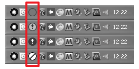
I did another round of 5-second tests – I showed people colour mockups of full screens with the icons in the taskbar and asked them what they meant. Most people understood what each colour represented and that they were something to do with IT services. However, when I tested in black and white, almost no one was able to tell them apart. The colours alone didn’t convey enough information and may have been confusing for colour-blind employees or people with badly calibrated monitors.
Recognition testing in black and white
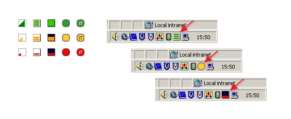
Design tweaks – added redundancy
I thought for a while how I could improve the design and then I remembered this 2 Rupee coin I’d seen while on a trip to India. Using redundancy in design is vital when conveying critical information, so I added features that would help the meaning survive the shift to black and white, bad monitors, or bad eyesight. The results were icons that communicated in 3 channels – colour, contrast, and symbol.
User testing phase 2 – Success
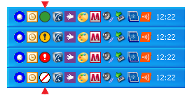
I showed black and white printouts to people and record their first comments – most people now correctly worked out the meaning and hierarchy of the status icons within the 5 second time limit.
Final design – black and white test
The green icon didn’t elicit any any particular significance from people but it didn’t matter as I identified in my analysis – when things are working you don’t need to be told about it, you already know. The light exclamation point against the red icon had a bolder contrast than the dark exclamation point in the yellow icon so people understood that it represented a stronger alert, and so their interest was piqued enough to click on it, which would bring up the full information seen in the status page above.
Final working design
Having seen the clear-cut results of user testing, the client was happy and the icons were packaged up in the next intranet update going out to over 5000 users in 16 countries.
Final design