User experience (UX) is the process of making a product such as a website or mobile app easy to use, visually pleasing, and emotionally positive – while striking the right balance between user needs and business goals.
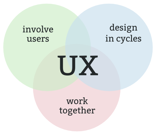
You can work towards a good UX by combining 3 essential elements: designing in cycles, collaborating across disciplines, and including your users through research or testing.
Find out more about what makes a good (or bad) UX in my blog, or contact me if you’d like help on your next UX project.