Do you remember the card game Top Trumps, where you beat your opponent’s hand with a card that outranks it in some capacity?
Well, in UX you can play a version of this where instead of carefully crafting the visual weight and placement of each element in your design to take into account the relative importance of each function, you just slap a big red button on the page, cos that just about trumps everything.
Usually it’s done as a joke, as on Maplin’s page here (they’ve since changed the design):

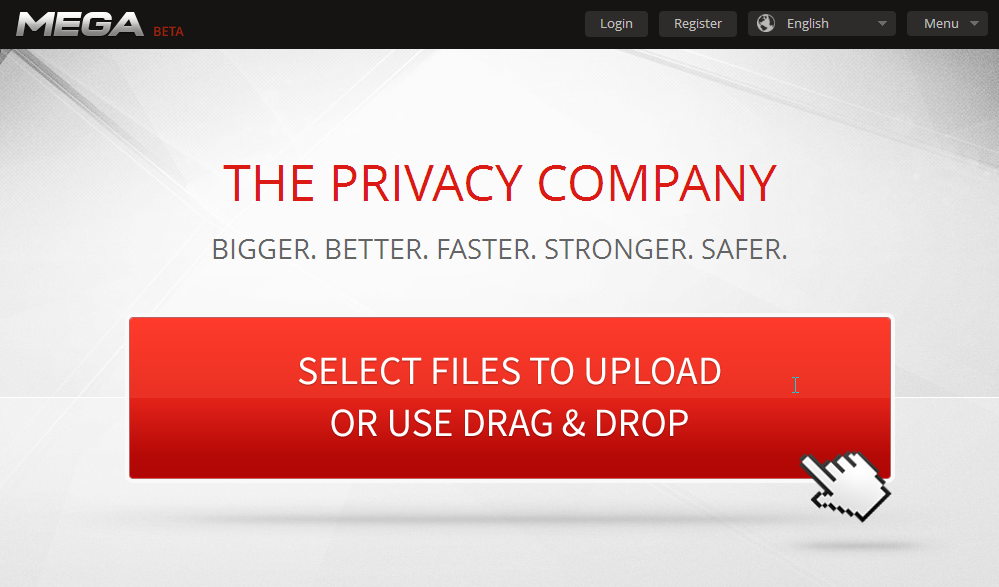
But Kim Dotcom’s new site Mega has the biggest big red button I’ve ever seen – and there’s not even anything else on the page! Well I suppose it was done to match his personality, big, bold and in your face.
The only time when I think it’s appropriate to have a big red button is for recording applications – there is a long history of red buttons to activate recording on real-world audio or video equipment, so it makes sense to mirror that online. Also, when the moment strikes, you need a large target to hit so you won’t miss a thing.
-
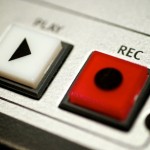
- Real world recording button
-
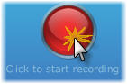
- Software recording button.