In 2010 I’d never thought I’d still need to persuade people not to write ‘click here’ links. So here we go again…
How people perceive a web page
People don’t read webpages, they scan them – so links must be written with keywords to support easy scanning:
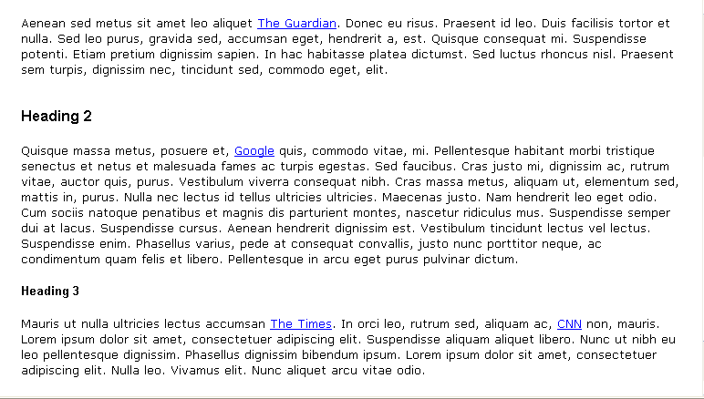
Simulation of what a webpage might look like when you read carefully...
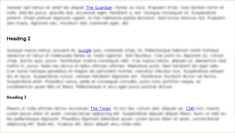
...and what it might look like when you scan - Only links and headings pop out.
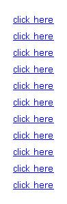
If you write ‘click here’ links, it impedes scanning:
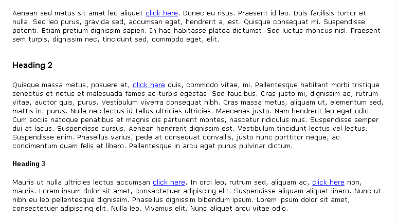
Simulation of a webpage with 'click here' links - ok if you like reading slowly and indepth...
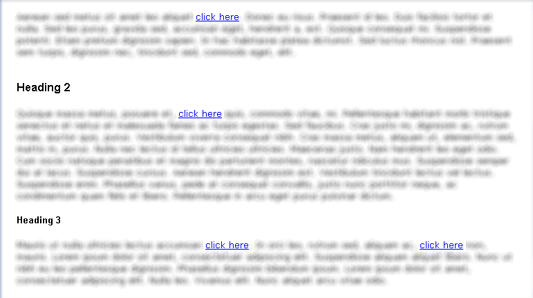
...but most of the time, you're scanning, so here you're forced to read around the links to see where they go
What a screen-reader does to links
There’s another reason not to write ‘click here’ links – if you want to make your pages more accessible to blind people using screen readers, as they will extract the links from a page and read them aloud as a list. Use keywords, so the links make sense out of context:
'Click here' links - useless!

Keyword links - Much better!
The recommendation regarding links…not to have “CLICK HERE” was wonderful. I just went to my ETUDES classes and changed all of my ‘click here’ to a word/phrase that identifies the link.